Here’s the thing about writing: it’s on everything. Newspapers, TV shows, blogs, web sites, Twitter, e-mails, press releases, yogurt cups, bus terminal walls, billboards, handbills—all these things are covered in copy. And, like most things in this world, 90% of it is just terrible.
It’s a lifeless, mediocre attempt at grabbing and keeping our interest, of sparking our imaginations, of helping or guiding or moving us. But until the PR industry comes up with some sort of sci-fi helmet that we can use to just beam our pitches directly into the brains of the people we want to speak to, we’ll have to learn to be brilliant among all this flotsam that the unfortunate public has been exposed to.
Or is it “to which the unfortunate public has been exposed?”
That’s another thing: I’m a former professional copyeditor, which means I’m the unofficial and unprofessional PRBC copyeditor [Editor’s Note — Thank heavens for TJ]. Yeah, I know a bunch of grammar rules, and I cringe when someone misuses a semicolon. But I’m not going to go gestapo on anyone who ends a sentence with a preposition. Writing (and, by extension, speaking and communicating) should be above all things clear, precise, and engaging. I’m not perfect, and neither is anyone else. This isn’t an exercise in perfect grammar and spelling. This is about justice.
So welcome to Your Copy Sucks, where I will hunt down examples of bad copy and I will make them pay. Consider this an informal laboratory where all flacks, young and old, experienced and green, myself included, can learn to be better writers. And bad writers can learn not to hit Print or Send before checking their work.
Oscar Wilde once said, when asked why he thought Americans were so violent, “Because your wallpaper is so ugly.” What he meant (and I am stealing this knowledge wholesale from Stephen Fry) is that an ugly environment is enough to bring everything else down with it, that is DOES matter what we surround ourselves with, that we should not stand for ugliness in our lives.
And we certainly mustn’t stand for ugly copy.
So let’s start with a softball.

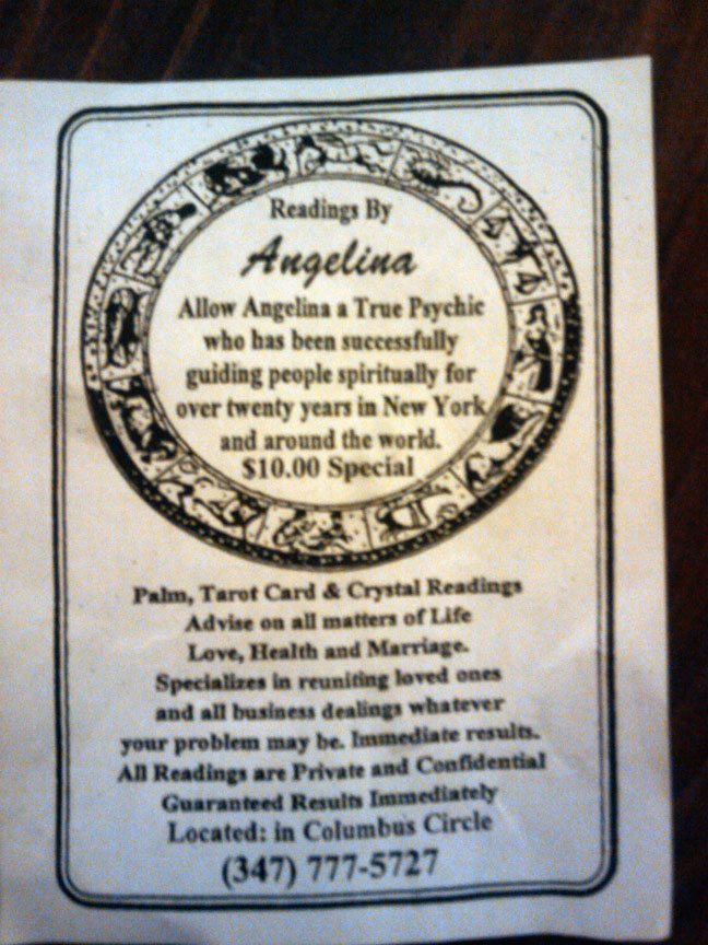
This is a handbill that my roommate was handed on the subway. (Don’t mind him; he’s new.) Let’s go through all the things that are wrong with this. And, oh Lord, there are many.
First of all, leaving aside how you feel about the Oxford comma for a moment, you still need a comma after the strangely capitalized Life. Otherwise, we’re left wondering what “life love” is, exactly. Also, you’re missing out on a whole host of commas in both the top and bottom sections, giving the impression that someone is trying to say everything in one long breath.
Second, let’s talk about capitalization for a second. I know that, in professional copy, we all have the tendency to try and make Things sound more Impressive than They Actually Are. We capitalize all sorts of things that do not need it, such as certain job titles and areas of study. And why you would choose to capitalize things like “True Psychic” and “Marriage” is beyond me.
Next, let’s talk about managing the expectations of the reader. This handbill makes the same promise not once, but twice: “Immediate results”? “Guaranteed Results Immediately”? What does that even mean? What kind of results? And why are you capitalizing it!? I would say most people are skeptical of psychics as a rule, and repeating this vague assurance isn’t really helping their case. If you only have 3×4 inches of paper in which to state your case (as a flack, your e-mail pitch will have even less space), don’t waste it repeating yourself. Plus, I’d rather see a psychic with a niche. Why doesn’t Angelina concentrate on reuniting loved ones or business dealings? Why the desperation in helping me solve “whatever my problem may be”? Specificity: it’s a paradox wherein the more narrow your focus, the more likely your audience will identify with you. This happens in fiction all the time; a well-rounded character is easier to relate to than a very generic one.
Lastly, look at the last line. “Located: in Columbus Circle” Wow. Why the colon? Why not just say “Located in Columbus Circle” or “Located: Columbus Circle”?
The sad part about this handbill is that, as my roommate pointed out, you’re almost tempted to spend the ten bucks just to see what the hell Angelina will do when you get there. This flier does leave that to your imagination, considering the run-on sentence at the top that just sort of . . . peters out. (What am I supposed to allow her to do!?) If anyone takes a field trip, lemme know how that shakes out for ya, okay? Wait, sorry: Let me Know How that Works out for You Spiritually I mean and Everything.
I haven’t even touched on the Magical Disappearing Full Stops. Maybe you see problems with this copy that I haven’t quite been able to spot in my enraged state. Let me know! And if you have photos or other examples of awful copy that makes your life just slightly worse, send them my way. You can always find me on Twitter @tjdietderich or via e-mail.